7.22.2015

Jurriaan Schrofer

Jurriaan Schrofer

Jurriaan Schrofer

Jurriaan Schrofer

Jurriaan Schrofer

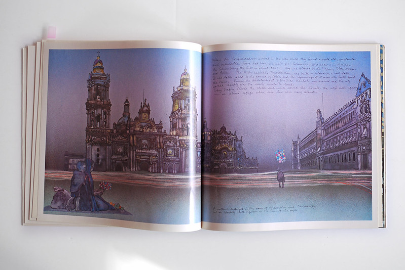
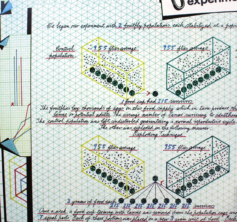
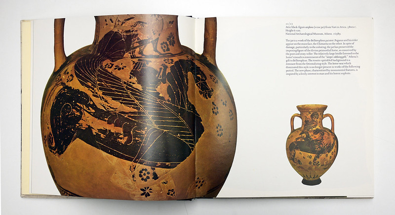
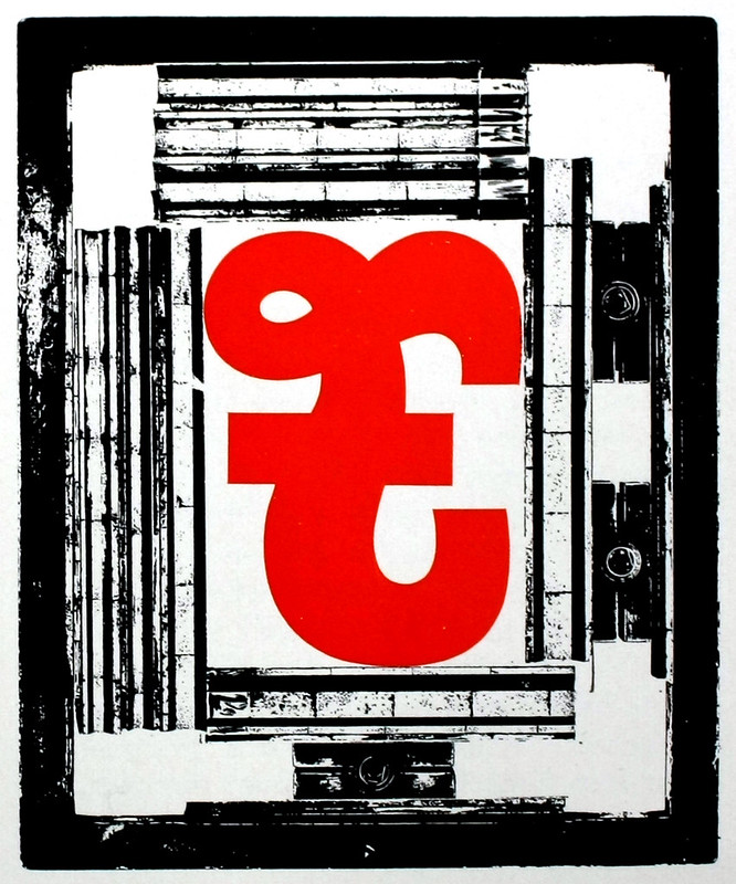
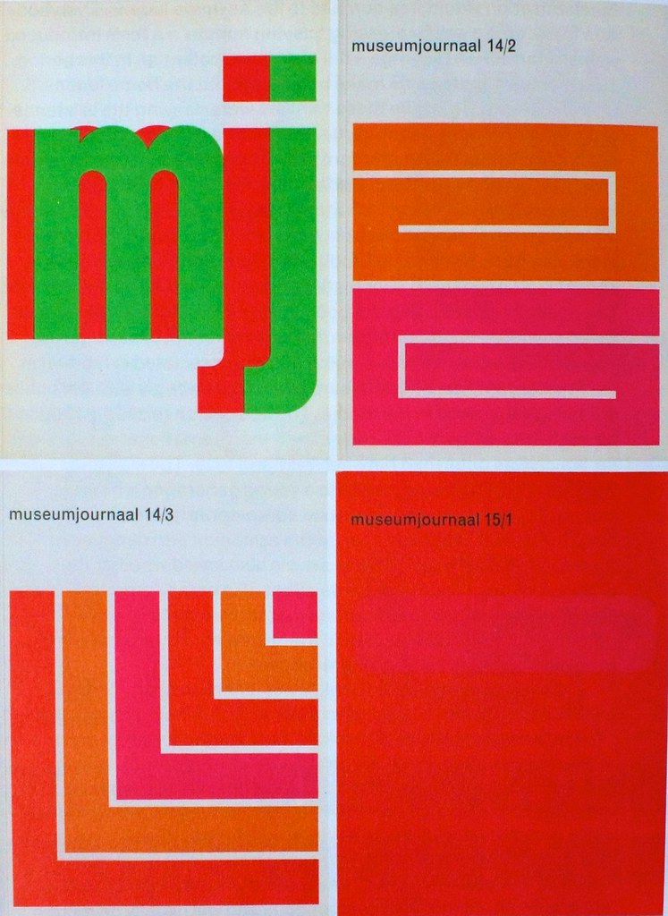
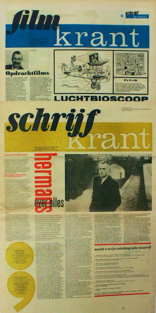
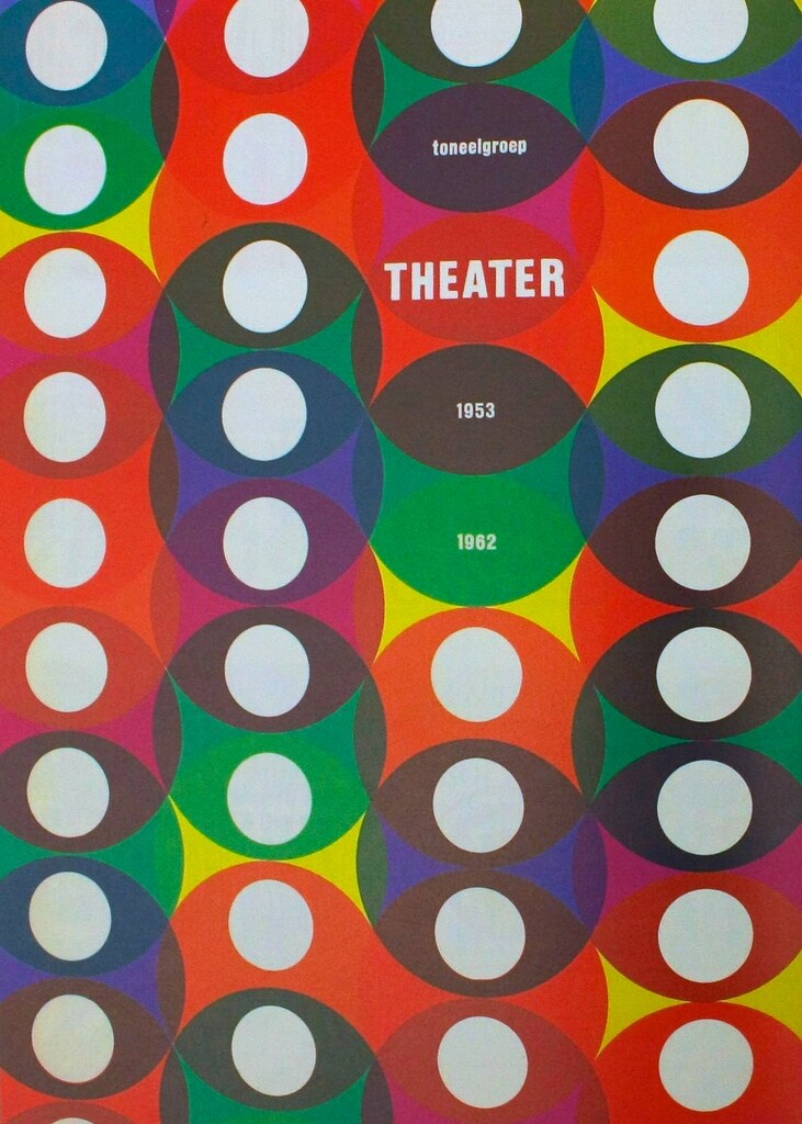
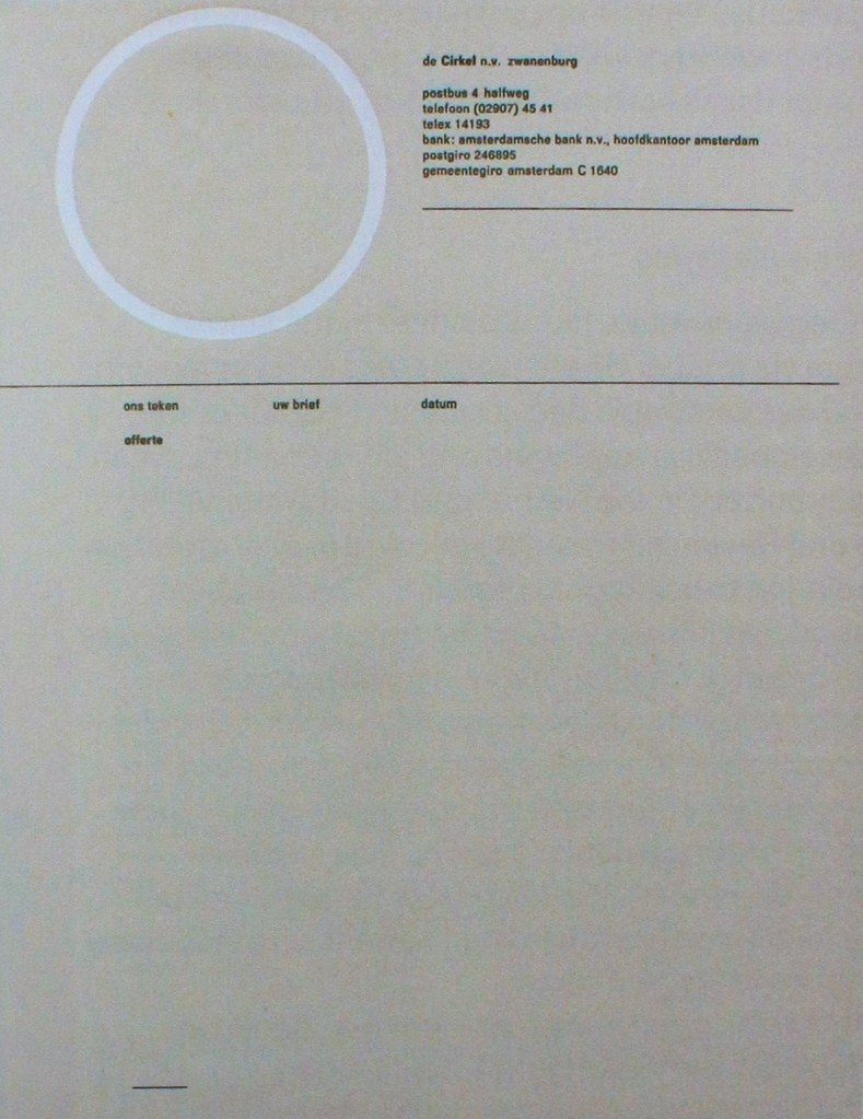
A few images from the Jurriaan Schrofer book reviewed in Eye 89. It's a great book. Well worth a look at.

12.23.2014

Pegasus

PEG-00 The highlight of Eye 88 has to be Pegasus magazine; the Mobil publication running from 1970 – 1985, designed by Derek Birdsall. Read more here.
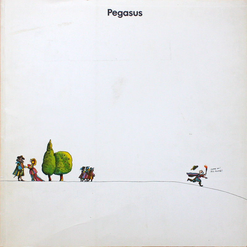
  PEG-03The combination of minimal layouts, large imagery and Michael Foreman imagery makes it a really interesting publication. Above is my favourite cover. I just don't think you could get away with that much white space in this day and age.
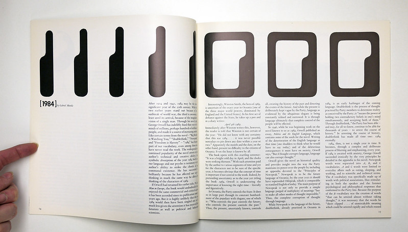
PEG-12
Here is my favourite text spread. It's so dense.

PEG-06
Here is my favourite Foreman spread.

PEG-13
Here is my favourite Foreman pullout.

PEG-02
Here is a detail from my favourite non Foreman illustration.

PEG-09
And here's my favourite large image. There are lots of full page double page images but I really like this series of classic layouts.

10.28.2014

Kodak Magazine

Kodak magazine

Kodak magazine

Kodak magazine

 Some pin ups from Kodak Magazine c1930's

10.14.2014

Some Herb

UandLC-01

Upper & Lowercase magazine
Art director: Herb Lubalin

This website is a brilliant resource where you can download entire issues.

http://blog.fonts.com/category/u&lc/

It's a great magazine. Even the simple text pages are elegant.

Upper & Lowercase
Upper & Lowercase
Upper & Lowercase

7.25.2013

Skyline

SKY_02.jpg
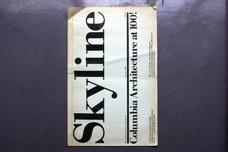
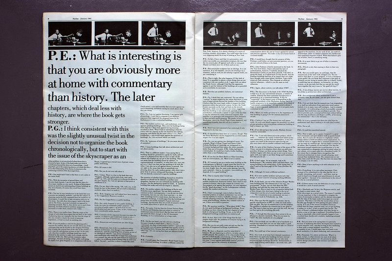
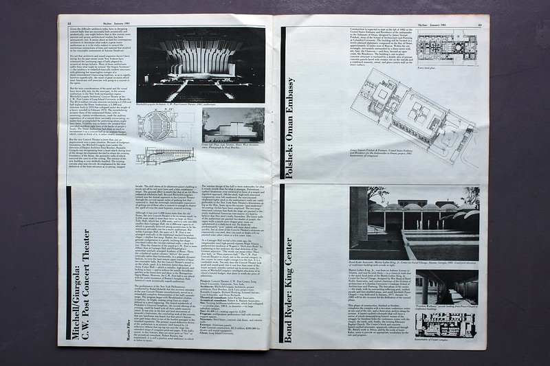
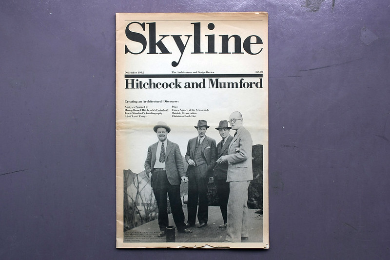
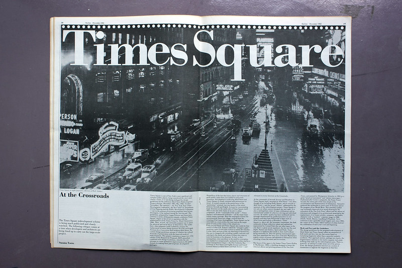
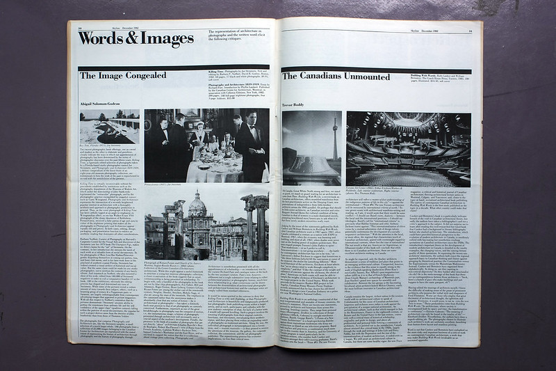
It's a classic. Massimo Vignelli is one of the greats who is widely documented. But it's a very special moment when you happen to see two issues of Skyline lying around. So here they are. If you want to see more then check out the Flickr stream. There's also more to read in Eye60 and Eye83. The Vignelli's gave a D&AD lecture a few years a go where Massimo said that you should never be fashionable, you should be timeless. Skyline is a perfect example of this. SKY_04.jpg
SKY_06.jpg
SKY_10.jpg
SKY_13.jpg
SKY_17.jpg
SKY_20.jpg
SKY_24.jpg
SKY_29.jpg
SKY_36.jpg

7.18.2013

2013 Update

poundsetting.jpg

Dear readers We have been terribly remiss in letting the blog get dusty and unloved. We have finally decided to do a spring clean and clear out the spam and upscale our pictures. In the process we have decided to stop using our paid for image service and use Flickr instead. This will all take a bit of time, so in the meantime, please bear with all the broken image links.

1.04.2013

90's Interview


Editor: Ingrid Sischy
Creative Director: Fabien Baron 
Issue: July 1990


I thought we'd kick off 2013 with an impulse ebay purchase over Christmas – one of my favourite magazines, 90’s Interview, Fabien Baron era. The magazine looks as great now as ever, but I think this is a beautiful example of Baron’s work of that period – carrying his signature style of vertical condensed Franklin Gothic page furniture in the first quarter of the magazine, followed by fireworks of big type and photography in the remaining pages. For me Fabien’s work isn’t amazing only because of the type, although he is of course a master in this respect, but he understands more than anyone the power of photography in editorial design. His striking type openers and page sequences owe a great deal to his taste and understanding of images and how to commission this for stories. Fernando Gutiérrez's comments on Baron’s work hit the mark in this short video for Phaidon.